Digital Color
See the book for a full discussion of digital tools and techniques that correct color casts and colorize images, including using Adobe Photoshop's Info panel to identify a color cast, and using Auto Color and Curves to remove excess color.
Making Digital Color Corrections with Variations
The two thumbnails at the top of the dialog box show the original photograph (Original) and the image at its revised state (Current Pick). As you make changes, the Current Pick image adjusts to reflect the modifications. Drag the Fine/Coarse slider to determine the amount of each adjustment. Apply the adjustments to particular parts of the image by selecting Highlights, Midtones, or Shadows, or adjust saturation by picking Saturation. We recommend adjusting in this order: the midtones, the highlights, the shadows and then saturation. Make sure the Show Clipping option is checked to show a preview of areas in the image that will be clipped – reduced to pure white or pure black – by a Highlight or Shadow adjustment.
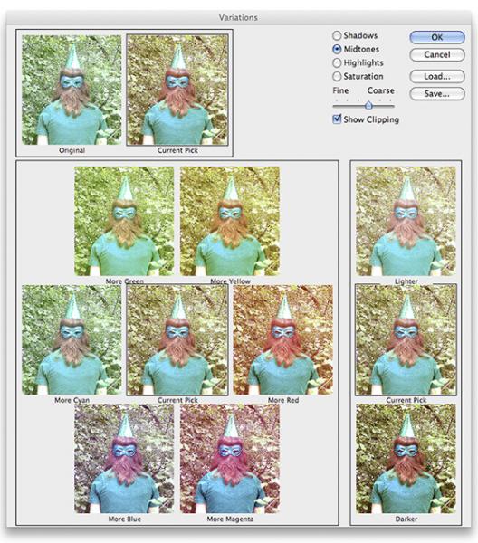
photo: Sarah Buckius. Adobe product screen shots reprinted with permission from Adobe Systems Incorporated.
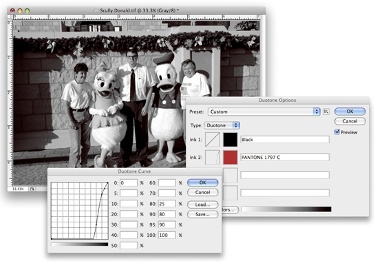
CREATING A DIGITAL DUOTONE
A photo that uses two colors is referred to as a duotone. A true duotone allows you to play with the tonal range of the image while adding color. We show you how to do this by converting the photo to Grayscale Mode and then to the Duotone Mode. The advantage of this method is that you can add color to the image’s shadow, midtone, or highlight areas.
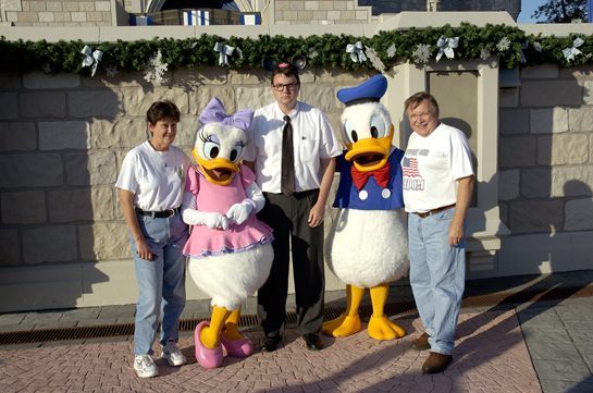 photo: Shawn Scully. Character #21, 2004, digital photographic print.
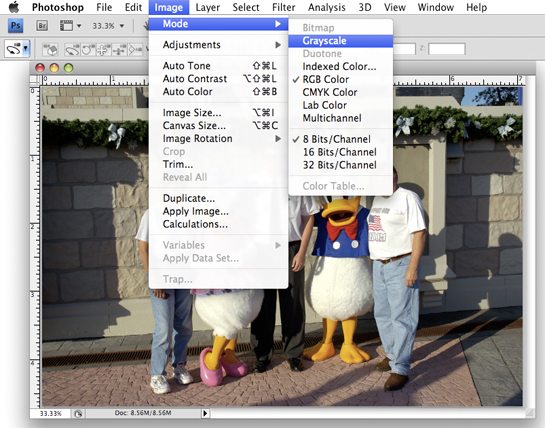
STEP 1: Convert to Grayscale.
Open the image in Photoshop. If working with a color RGB image, you will need to change it to Grayscale by selecting Image > Mode > Grayscale. (We recommend working from a duplicate file so that you retain a copy with the original color information.) After selecting Grayscale, Photoshop will warn you that you are about to discard your color information. Click Discard.
STEP 2: Convert to duotone mode.
Now, select Image > Mode > Duotone. The Duotone Options dialog box will open. Select Duotone from the Type menu.
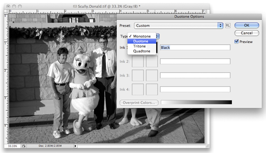
STEP 3: Custom and Preset Duotones.
In the Dutotone Options box, you can choose a Preset or you can adjust the duotone manually.
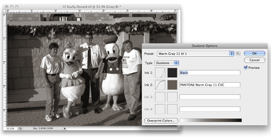
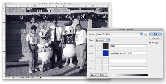
Preset Duotones
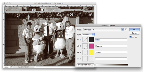
Experiment with the presets because many of their color combinations produce quite beautiful images and may also be recommended by commercial printers. In the presets, black is selected as a default choice for Ink 1 because most duotones contain black and one other color—represented by Ink 2. Notice that the curves next to the Ink color swatches adjust for changes in tonality as you change the preset. Some of the presets have more than two colored inks with black (such as the third example below) making them tritones and quadtones.
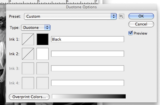
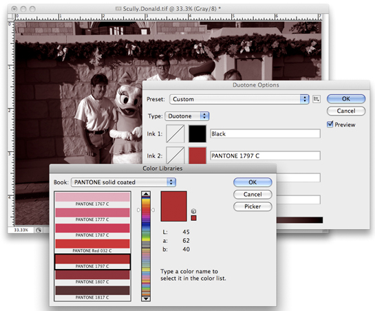
Custom Duotones.
To apply custom duotones, you will work with two inks. Black is still the default choice for the Ink 1. However, you can change the black ink by clicking on the black thumbnail color. We are going to keep black as our first color, so we will choose the second ink by clicking once inside the blank thumbnail image by Ink 2.
STEP 4: Select a custom color for Ink 2.
Clicking on the Color Box opens up the Color Libraries. Clicking on a color within the list places it in the Ink 2 Color Box and previews that color within your image. Select a color and click OK.
STEP 5: Adjust tones using Curves.
Now that you’ve chosen the two colors in your Duotone, your image may have become increasingly darker in tone. This is because you have just added additional density to the grayscale image. To adjust the amount of ink used within the highlight, midtone, and shadow areas, you will use Curves. In the Duotone Options box, the first box within each Ink line (to the left of the Color Box) is the Curve Box. Curves allow you to designate how a color appears throughout the tonal range of the image.
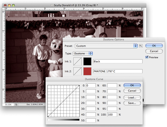
Click once on the Curve Box for Ink 2. A dialog box will open. The default curve is set up so that the second color is distributed evenly throughout the image in the same quantities as your black color (100% in the 100% shadow areas and 0 in the 0% shadow areas -- the highlights with the full gradation in between). Any changes you make to this curve can be revised and the original grayscale data will not be altered. You can also alter the Black curve in Ink 1 if need be.
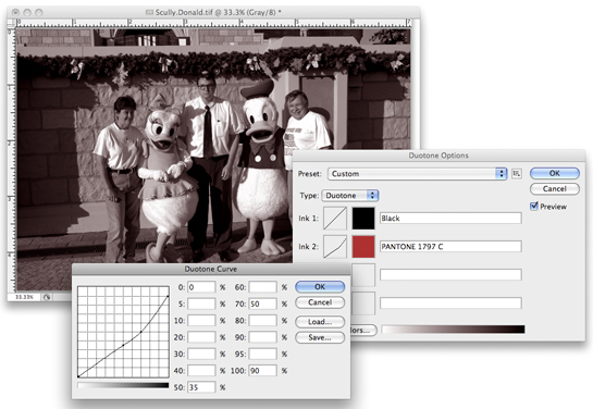
VERSION 1:
For this version, we entered 90% in the 100% shadow areas, 50% in the 70% density areas and 35% in the midtone areas.
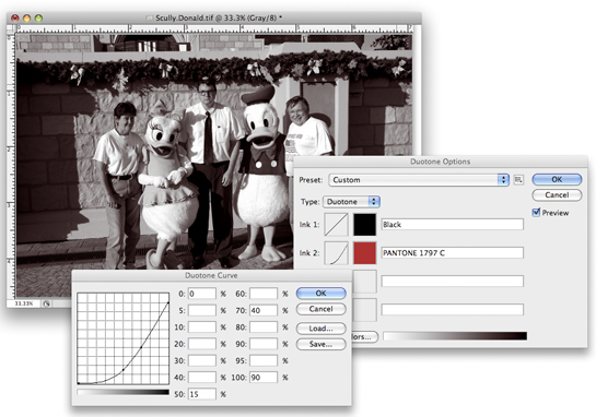
VERSION 2:
For this version, we entered 90% in the 100% areas, 40% in the 70% density areas and 15% in the 50% midtone areas for a subtler and less dense duotone.
VERSION 3:
For this version, we increased the amount of ink in the shadow areas by entering 90% in the 95% shadow areas, 80% in the 90% areas and 25 in the 80% areas. Therefore, the reddish-pink ink is now only in the shadow areas.
* All Adobe product screen shots reprinted with permission from Adobe Systems Incorporated.